In this article you will learn how to use SPSS in order to plot multiple bar graphs on the same figure, in which each bar chart corresponds to a different variable.
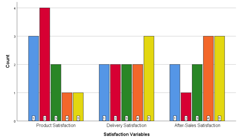
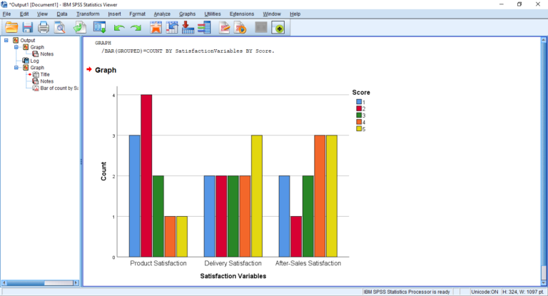
The following will be the final output which is a chart with 3 bar graphs for three different variables namely: “Product Satisfaction”, “Delivery Satisfaction” and “After-Sales Satisfaction”.
Unlike R and Python, SPSS does not have a quick command or button to obtain such a plot. The secret is to tweak the way the data is inputted in SPSS. However, don’t worry, this process is still fairly easy and explained step-by-step in the worked example below!
What is the advantage of plotting multiple bar charts?
The main advantage of plotting one figure with various bar charts for multiple variables is that it saves space in your reporting of the statistical output. Moreover your report will look much cleaner and also one can make quick visual comparisons of the distributions of the different variables.
Step 1: The data file
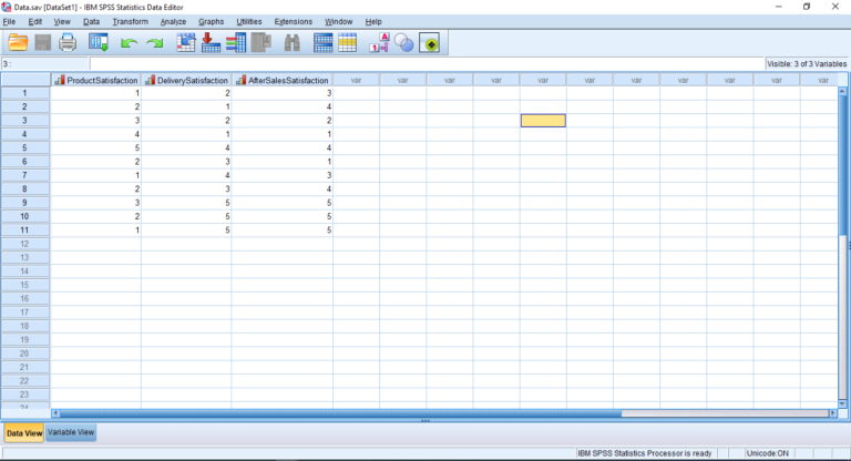
The following is a screenshot of the SPSS data file that will be used for this example. We have three variables, namely: Product Satisfaction, Delivery Satisfaction and After-Sales Satisfaction. We have 11 records (rows) representing the data of 11 different customers. So here each customer gives a score for his/her product satisfaction level, his/her delivery satisfaction level and his/her after-sales service satisfaction level. Note that for this example each score ranges from 1 (very low satisfaction) to 5 (very high satisfaction).
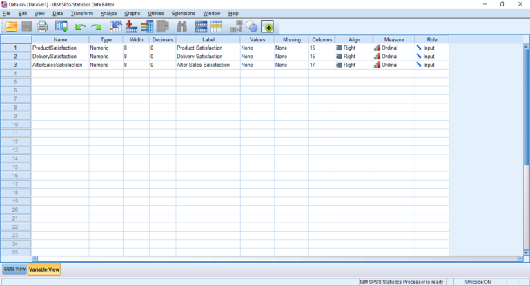
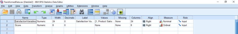
The next screenshot shows the variable view of our data. This can be seen by clicking the bottom left button “Variable View”. The variable view shows the list of variables. The columns “Name” and “Label” show the name of the variable. The “Type” is numeric, because each score is a number (ranging from 1 to 5). The “Decimals” is fixed to 0, because the scores are integer. The “Measure” of each variable is set to “Ordinal”, because satisfaction scores are ordinal.
Step 2: Changing the format of the data
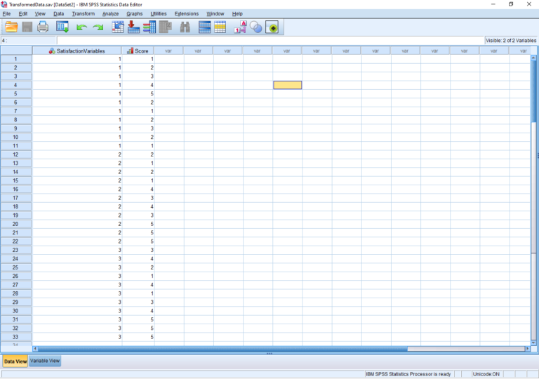
We will open a new SPSS file because we are going to change the format of the data that will be used for our plot. The following is a screenshot of data in the new format. The second column named “Score” is obtained by combining the three columns of the previous data file. In the first column named “SatisfactionVariables”, 1 represents Product Satisfaction, 2 represents Delivery Satisfaction and 3 represents After-Sales Service Satisfaction. Hence each number is repeated 11 times.
The following is the Variable View of the data. Note that the “Type” of each variable is set to “numeric”. The measure of the variable “Score” is set to “Ordinal”. The measure of the variable “Satisfaction Variables” is “Nominal” since we have 3 categories “Product Satisfaction”, “Delivery Satisfaction” and “After-Sales Satisfaction”.
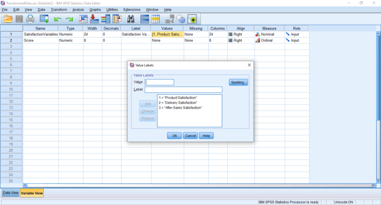
Moreover for “Satisfaction Variables”, click the “Values” cell, and set the values as follows:
Insert “1” in the “Value” box, insert “Product Satisfaction” in the “Label” box, and click “Add”;
Insert “2” in the “Value” box, insert “Delivery Satisfaction” in the “Label” box, and click “Add”;
Insert “3” in the “Value” box, insert “After-Sales Satisfaction” in the “Label” box, and click “Add”;
Click “OK”.
Step 3: The Plot
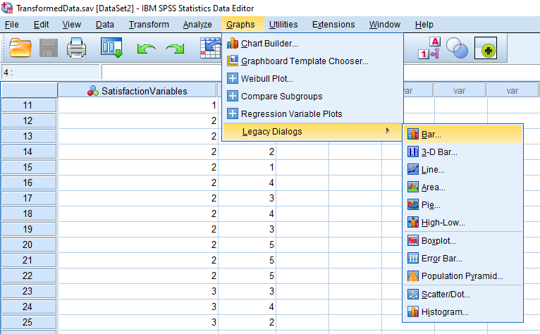
We are now ready to get the plot of bar graphs. Follow the following path: Graphs > Legacy Dialogs > Bar
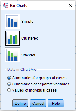
Choose “Clustered” and click “Define”.
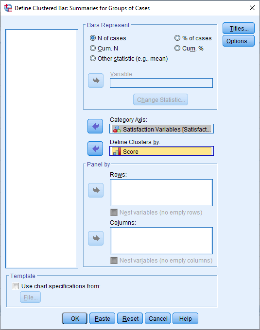
Put the variable “Satisfaction Variables” in the “Category Axis” box and the variable “Score” in the “Define Clusters by” box, and click “OK”.
We obtain the following output:
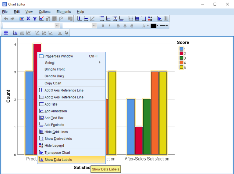
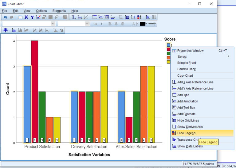
Double-click on the graph in order to get the Chart Editor Window. Right click on the bars, and click “Show Data Labels”.
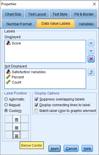
Put “Score” in the “Displayed:” box and for the label position choose the “Custom” radio button and click the “Below Center” icon. Then click “Apply” and close the “Properties” window.
Right-click on the legend and choose “Hide Legend”.
Close the Chart Editor Window and you obtain the chart with bar charts for multiple variables.