Financial Mathematics Timeline Diagram with ggplot2 in R
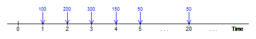
In this article, we will present an R function that uses the ggplot2 package in order to plot a timeline diagram/plot. In the study of Financial Mathematics, the timeline diagram is essential to visualise payments or series of payments due at different time units, in particular annuities and perpetuities . The function which we shall call “Timeline” accepts certain parameters as input and plots a timeline such as the following:
One can find the code for the “Timeline” function in the github repository: https://github.com/MarkDebono/Financial-Mathematics-Timeline-Plots-with-ggplot2
The function Timeline(TimePoints, PaymentTime, PaymentAmount, Colour, ArrowColour, FontSize) accepts the following parameters:
TimePoints: This is a vector with the time values (or points) that are going to be displayed in the horizontal axis of the timeline diagram.
PaymentTime: This is a vector with the time values at which their is going to be a payment. These will be represented by vertical downward arrows in the timeline diagram. Note that PaymentTime must be a subset of the vector TimePoints.
PaymentAmount: This is a vector with the amount of each payment. This will determine the labels above each arrow on the timeline diagram. Note that the length of the PaymentAmount vector must be equal to the PaymentTime vector.
Colour: This determines the colour of the payment amounts labelled on the timeline diagram.
ArrowColour: This determines the colour of the vertical downward arrows of the timeline diagram.
FontSize: This determines the font size of the payment amount labels. An appropriate range of values is: 2-5. The values 2.5 and 3 should work fine the majority of timeline diagrams.
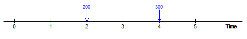
Let us give a number of examples. First of all the “ggplot2” package must be loaded into R. The horizonal axis will show the values 0,1,2,3,4,5 as described in the TimePoints vectors. However arrows will only be shown on time 2 and time 4 as described in the PaymentTime vector.
library(ggplot2)

TimePoints<-c(0,1,2,3,4,5)
PaymentTime<-c(2,4)
PaymentAmount<-c(200,300)

Timeline(TimePoints,PaymentTime,PaymentAmount,'blue','blue',2.5)
We get the following timeline:
We can play around with just the colours.
Timeline(TimePoints,PaymentTime,PaymentAmount,'purple','orange',2.5)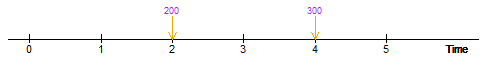
We could give the exact hexadecimal colour codes for the colours:
Timeline(TimePoints,PaymentTime,PaymentAmount,'#21618c','#117864',2.5)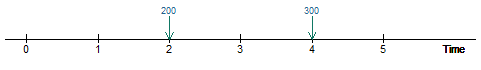
We can change the font size of the payment amounts:
Timeline(TimePoints,PaymentTime,PaymentAmount,'#21618c','#117864',4)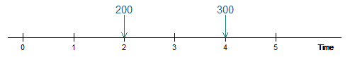
We can display dots in the horizontal axis, by writing “dots” in the TimePoints vectors, for example in the case of an annuity.
TimePoints<-c(0,1,2,3,"dots",20)
PaymentTime<-c(1,2,3,20)
PaymentAmount<-c(500,500,500,500)

Timeline(TimePoints,PaymentTime,PaymentAmount,'black','black',2.5)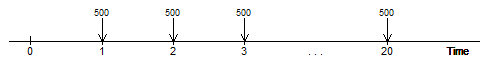
Similarly, dots can also be used to depict the timeline of a perpetuity.
TimePoints<-c(0,1,2,3,"dots",20,"dots")
PaymentTime<-c(1,2,3,20)
PaymentAmount<-c(500,500,500,500)

Timeline(TimePoints,PaymentTime,PaymentAmount,'black','black',2.5)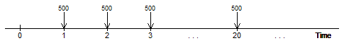
The payment amount labels can also accept text.
TimePoints<-c(0,1,2,3,"dots",20,"dots")
PaymentTime<-c(1,2,3,20)
PaymentAmount<-c("R","R","R","R")

Timeline(TimePoints,PaymentTime,PaymentAmount,'black','black',2.5)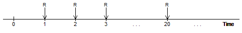
Currency symbols can be displayed in the payment amount labels:
TimePoints<-c(0,1,2,3,"dots",20,"dots")
PaymentTime<-c(1,2,3,20)
PaymentAmount<-c("\u20ac 500","\u20ac 500","\u20ac 500","\u20ac 500")

Timeline(TimePoints,PaymentTime,PaymentAmount,'red','red',2.5)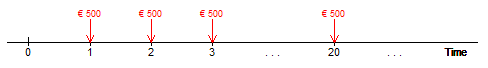
Finally, the horizontal axis can also accept text as its time points:
TimePoints<-c(0,1,"dots","m","m+1","dots","n-k","n-k+1","dots","n","dots")
PaymentTime<-c(1,"m","n-k+1","n")
PaymentAmount<-c("\u20ac 200","\u20ac 200","\u20ac 400","\u20ac 400")

Timeline(TimePoints,PaymentTime,PaymentAmount,'purple','purple',2.5)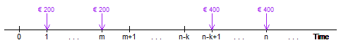
You can find the code for the function “Timeline” in the following github repository: https://github.com/MarkDebono/Financial-Mathematics-Timeline-Plots-with-ggplot2